New York Times App finally gets it! (@nytimes, @ios7)
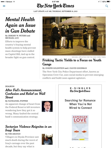 The New York Times app on the iPad has been one of my most used, least liked apps. However, that changed with their new iOS7 layout released yesterday. They've released a new app that is fluid, good looking and finally feels like it is designed for the iPad experience.
 Gone is the boxy, cramped layout with difficult pinch-to-close article gesture and the popover for section configuration menu. Instead, you have a simple back icon for going back to the main section from an article. You have a more lucid section transition from top to bottom. Even the background update has worked really well so far. A really pleasant experience.
The couple things I am not crazy about are the italicized titles and the small '+' icon to expand section content. I get its need but seems a bit needless and hard to click. Though it does seem to remember the sections you've expanded and keeps them that way. Cool. The section configuration on the left is also far more pleasant and usable.
Great job, NYTimes team! I can finally enjoy my morning paper again!